Contact Page Best Practices for Small Business: Turn Clicks into Customers
webceke
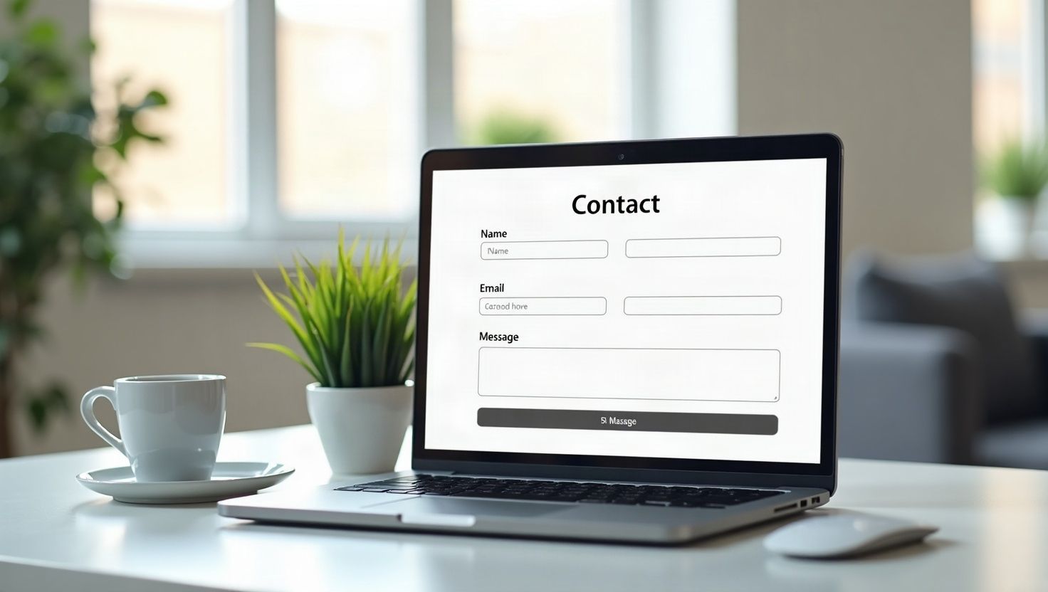
Your contact page is often the last stop before a visitor becomes a customer. Yet most small business owners treat it as an afterthought—a simple form and an email address. That’s a missed opportunity. A well-designed contact page can be one of your most powerful lead-generation tools. In this guide, you’ll learn contact page best practices for small business, with practical steps you can implement today, even if you’re using an AI website builder like webceke.
Start with a Clear Goal and a Compelling Headline
Before you design anything, decide what you want visitors to do. Do you want them to request a quote, book a call, or ask a question? Your contact page should have one primary action. A vague page with multiple options confuses visitors and reduces conversions.
Your headline should reinforce the benefit of reaching out. Instead of “Contact Us,” try “Get Your Free Quote in 24 Hours” or “Book Your Consultation Today.” This sets expectations and gives visitors a reason to act.
Design a Lead-Friendly Layout
Your contact page layout should guide the eye toward the form. Follow these layout best practices:
- Keep the form above the fold on desktop and mobile. Don’t make visitors scroll to find it.
- Use a single column for the form—multi-column forms cause drop-offs.
- Place contact details (phone, email, address) to the side or below the form, not above it. The form is the star.
- Add a map or a photo of your team to humanize your business and build familiarity.
- Minimize navigation links on this page to avoid distractions. A bare-bones layout works best.
For example, a local plumber might place a simple “Request a Callback” form at the top, with phone number and service area listed below. This removes friction and makes it easy for busy homeowners to reach out.
Keep Your Form Short and Smart
Every extra field costs you leads. Studies show that reducing form fields from 11 to 4 can increase conversions by up to 120%. For a small business, ask only for what you need to follow up:
- Name
- Email or phone (choose one as primary)
- A message or a dropdown for the service needed
Avoid asking for company size, budget, or anything that feels invasive at first contact. If you need more info, you can collect it later via email or phone.
Use conditional logic if your builder supports it. For example, if a visitor selects “Web Design,” show a field asking for their website URL. This makes the form feel personalized without adding friction.
Add Trust Signals to Reduce Anxiety
Visitors are wary of spam and scams. Trust signals reassure them that their information is safe and that you’re a legitimate business. Include:
- A privacy statement near the form: “We respect your privacy. Your info is never shared.”
- Testimonials or reviews from happy customers, ideally with a photo or company name.
- Certifications, awards, or industry badges (e.g., Google Guaranteed, BBB Accredited).
- A photo of your physical storefront or team to show you’re real.
One effective pattern is to place a short testimonial right below the form. For instance, a freelance photographer might add a quote from a client: “Booked in minutes, and the photos were amazing!” This social proof works wonders.
Optimize for Mobile: The Majority of Your Visitors Are on Phones
More than half of web traffic comes from mobile devices. If your contact page isn’t mobile-friendly, you’re losing leads. Key mobile optimization tips:
- Make the form fields large enough to tap easily (at least 44px tall).
- Use a responsive layout that stacks everything vertically on small screens.
- Enable click-to-call for your phone number—one tap should start the call.
- Test the page on an actual phone to ensure the form doesn’t require horizontal scrolling.
- Minimize text—mobile users want to act, not read paragraphs.
A mobile-optimized contact page feels fast and effortless. If your form takes more than a few seconds to load or is hard to type on, visitors will bounce.
Put It All Together: A No-Code Checklist for AI Website Builders
You don’t need a developer to implement these best practices. With an AI website builder like webceke, you can generate a professional contact page in minutes. Here’s a simple checklist to follow:
- [ ] Write a benefit-driven headline (e.g., “Get Your Free Quote Today”).
- [ ] Place a short form (name, email, message) above the fold.
- [ ] Add a privacy note and a testimonial near the form.
- [ ] Include your phone number with click-to-call on mobile.
- [ ] Add a map or photo to build trust.
- [ ] Remove extra navigation links from the page.
- [ ] Test on mobile and ensure the form is easy to use.
Webceke lets you generate a complete, multilingual site from a single sentence, and you can customize your contact page with these elements without touching code. It’s the fastest way to launch a lead-ready website.
Start Generating More Leads Today
Your contact page is a high-traffic, high-intent page—don’t waste it. Implement these contact page best practices for small business, and you’ll see more inquiries, more calls, and more customers. If you’re ready to build a professional site that converts, try webceke for free and create a contact page that works as hard as you do.